【デザイン】Helvetica Standard
1 :名無しさん@涙目です。(dion軍):

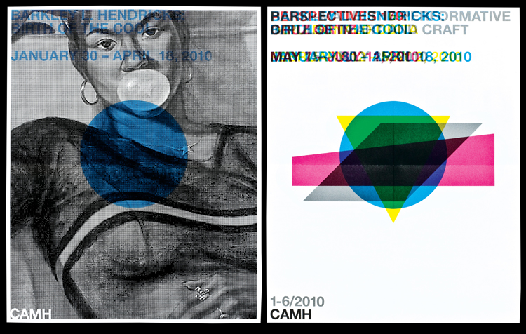
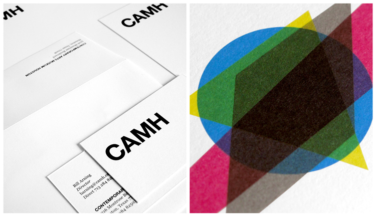
Aiming To Become Iconic, A Houston Museum Morphs Its Building Into A Logo
Although it never made it into the architectural cannon, the stainless-steel-clad structure,
designed by Latvian-born Gunnar Birkerts in 1972, is a standout work, especially for Houston.
(Birkerts, the father of the literary critic Sven Birkerts, is better known for the Federal
Reserve Bank of Minneapolis, 1973, and the Kemper Museum of Contemporary Art,
in Kansas City, 1994.) Various views of the building yield four distinctive geometric
shapes, which the New York-based firm AHL & Co. layered on top of each other
like a CMYK collage. (The previous logo was a flat, literal representation of the museum.)
The mark can be used separately or in combination with the acronym in Helvetica Bold and all caps.
http://images.fastcompany.com/upload/CAMH_Co.Design_AHL-CO_011.jpg
http://images.fastcompany.com/upload/CAMH_Co.Design_AHL-CO_06.jpg
http://www.fastcodesign.com/1663799/aiming-to-become-iconic-a-houston-museum-morphs-its-building-into-a-logo
|
|
|